Still, Syracuse fans have seen a flux of changes, from one to logo to another, from Orangemen to Orange, and from one uniform design to the next.
With spring in the air, and the eagle-eye of the threads @NunesMagician bringing light to a potential white pants change, we've decided to take a look back at football jerseys of the past.
You surely have seen these uniforms on numerous sites, a few have made top 10 ugliest of all time articles, but here's an attempt at bringing them all under one post.
It seems as if Syracuse basketball fans have their favorite, or at least portions (many choose the script Syracuse).
But we're looking for judgement on which parts of the Syracuse football uniform we're proud of, and not so proud of. We'll be leaving a few comments beneath each photo.
Leave your comments and we'll let Doc Gross know.
THE SYRACUSE FOOTBALL UNIFORM COLLECTION:
The Champs Gear - 1950s
Have to rate this a 10. Can't say anything bad about the jersey worn during the era of our only National Championship. SU should do a throwback day to these.
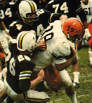
Ground and Pound - 1960s
Not a ton of color on the top, but I do like the orange helmet and pants matching, especially with the number on the helmet.
Skip the 70s and.....
The Dome-ination: 1980s
Simple jerseys that let the Syracuse name speak for itself. I love these. At first, the number on the pants seems like a cool touch, but now all I can think of is some Aeropostale sweatpants.
Bowl Bound: 1990s
And a view of the white
I love the uniforms. I feel as if the deep V is a bit too deep, but otherwise the jersey is excellent. Not sure how I feel about the different trims on the pants and jersey.
The Shit Sandwich - 2000s
It started out OK with the Insight Bowl win.
Then it went south in a hurry. Syracuse kept the same McNabb uniforms till Mr. Robinson came in to drastically change the program.
Here are a few of uniforms of that era:
Don't like the shade of the Orange pants. Shoulder piping is awful and appears randomly placed. No trim to be seen anywhere on the uniform. Do like the homage to the past with the player numbers on the helmet. But by now, as athletes seemingly have become more self-absorbed, maybe a team logo is the way to go.
Rock Bottom:
A consensus worst uniform of all time.
Next, a little white was added all over, but I still wasn't a huge fan. Do like the change back to white numbers with an orange trim.
Oh hi Andrew Robinson!
Then in came Dougles and here is our current gear:
Better than the previous version, no doubt, but to me a bit plain up top.
Conclusion?
See if you can outfit the McNabb era jerseys with a slightly less deep V-neck and those short sleeves that seem to be hip these days.
Leave your thoughts below.
Pin It Now!


No comments:
Post a Comment
Note: Only a member of this blog may post a comment.